





Table of Contents
Introduction
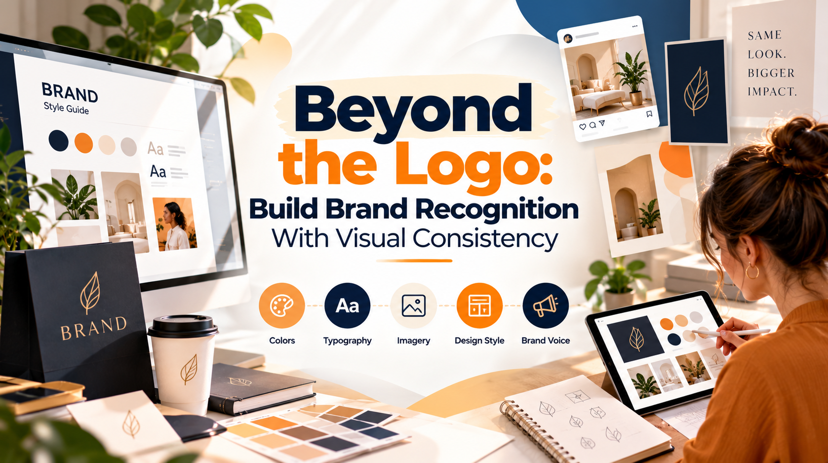
A memorable brand is rarely built through a logo alone. Think about the businesses you recognize instantly, even before reading their names. Their colors, typography, imagery, packaging, and overall visual style often make them familiar. This familiarity comes from visual consistency, which helps businesses create a recognizable identity across different platforms and customer interactions.
In today’s competitive digital marketplace, customers encounter brands through websites, social media posts, advertisements, emails, and product packaging. When these visuals feel connected, they help communicate the brand’s personality and make the business easier to remember. Consistent visual branding is not about making every design identical; it is about creating a recognizable experience wherever customers see your brand.
Why Does Visual Consistency Matter for Brand Recognition?
Visual consistency helps customers connect different marketing materials to the same business. When a company repeatedly uses recognizable colors, typography, imagery, and layouts, its visual identity becomes more familiar over time.
For example, a business that uses the same brand colors on its website, Instagram posts, and promotional emails creates a stronger connection between those touchpoints. Customers can more easily recognize that the content belongs to the same company, even when the message or format changes.
Consistency also communicates professionalism. When a brand’s visuals feel organized and intentional, customers may develop greater confidence in how the business presents itself. However, design consistency alone cannot guarantee trust or sales. Product quality, customer service, clear communication, and reliable experiences matter just as much.
7 Ways to Build a Consistent Visual Brand Identity
Colors are among the most noticeable elements of a brand style identity. A carefully selected palette helps create a consistent appearance across digital and offline materials.
Choose a primary brand color, supporting colors, and a small number of accent shades. Define where each color should be used, such as in headlines, backgrounds, buttons, or promotional highlights. Document the exact color codes so designers can reproduce them accurately.
Avoid changing your brand palette for every campaign simply to follow a trend. Seasonal campaigns can introduce variations, but the core visual identity should remain recognizable.
Typography influences how customers perceive a brand. Bold typefaces may communicate energy, while clean and simple fonts can create a modern appearance. The key is selecting typography that suits your audience and remains readable across different devices.
Establish a clear hierarchy for headings, subheadings, body text, and calls to action. Limit the number of font families and document the sizes and weights used in common design formats.
Consistent typography makes content easier to scan and helps marketing materials feel connected, whether they appear on a website, brochure, or social media graphic.
A brand style guide turns visual preferences into repeatable design rules. Without one, different designers or team members may use slightly different colors, fonts, logo versions, and image styles.
Your guide should explain how to use the logo, which colors and fonts are approved, how images should look, and how layouts should be structured. Include examples of correct and incorrect usage where helpful.
A practical guide does not need to be complicated. Even a concise document can help internal teams and external designers maintain a consistent brand identity as the business grows.
Your logo is an important part of your visual identity, but its effectiveness depends partly on how it is used. Stretching it, changing its colors without a clear reason, placing it against unsuitable backgrounds, or crowding it with other elements can weaken its presentation.
Create approved logo variations for light and dark backgrounds, and define minimum sizing and clear-space requirements. Make sure the logo remains legible on mobile screens and small promotional materials.
A consistent logo treatment helps customers recognize the brand without making the logo the largest element in every design.
Photography, illustrations, icons, and graphics contribute to a brand’s overall personality. A business may have consistent colors and typography but still look disconnected if every image follows a different visual style.
Choose imagery that reflects the brand’s tone. For example, a premium skincare company might use clean compositions, soft lighting, and uncluttered product photography, while a youth-focused fitness brand might prefer energetic imagery and stronger contrast.
Apply these choices across websites, social media, advertisements, and email campaigns. Consistency does not require using the same image repeatedly; it means selecting visuals that feel like they belong to the same brand.
The right graphic designing platforms can make it easier to maintain a consistent visual identity, particularly when multiple people create content for the same business.
Tools such as Canva, Adobe Express, and Figma offer different features for creating and managing visual content. Canva and Adobe Express can be useful for social media graphics and reusable marketing templates, while Figma is often used for collaborative interface design and design systems.
The best platform depends on your workflow, budget, and design requirements. Regardless of the tool, establish approved templates, color palettes, font styles, and logo assets. A platform can simplify the process, but consistent results still depend on clear brand guidelines and thoughtful design decisions.
Before publishing a graphic, use a simple graphic design test to check whether it communicates the intended message clearly. View the design at its actual display size and ask whether the headline stands out, the text is readable, and the brand is recognizable.
You can also ask someone unfamiliar with the design to look at it briefly and explain what they noticed. Their response may reveal issues that are easy to overlook after spending hours working on the same creative.
Review colors, typography, spacing, image quality, and calls to action. For marketing campaigns, compare performance metrics such as click-through rates, qualified leads, and conversions when testing different design versions. This turns design review into a practical improvement process rather than relying only on personal preference.
Visual Branding Priorities
Graphic Designing Mistakes That Can Weaken Brand Recognition
Even attractive visuals can create confusion when they lack consistency. Common graphic designing mistakes include using too many fonts, changing brand colors without a clear reason, stretching logos, mixing unrelated image styles, and overcrowding layouts with unnecessary text.
Another mistake is choosing a design trend simply because it is popular. A style that works for one business may not suit another brand’s audience or personality. Similarly, copying a template without adapting it to the brand can make marketing materials feel generic.
To avoid these problems, use a shared style guide, create reusable templates, and review materials before publication. Consistency does not mean eliminating creativity. It means ensuring that creative choices support the brand rather than competing with its identity.
How Visual Branding Supports Business Growth
A consistent visual identity can help businesses present a more coordinated image across customer touchpoints. It can also make content production more efficient because teams can reuse approved layouts, colors, fonts, and design components instead of starting from scratch each time.
For small businesses, this approach offers a practical way to create professional marketing materials without needing an entirely new design system for every campaign. Consistent branding can support social media marketing, advertising, website design, email campaigns, and sales materials.
From an SEO and digital marketing perspective, a coherent visual experience can help make the transition between an advertisement and its landing page feel more natural. However, visual consistency alone does not guarantee higher search rankings or conversions. Content relevance, usability, technical performance, and the quality of the offer remain important.
Final Thoughts
Building brand recognition takes more than creating an attractive logo. It requires a consistent visual language that connects colors, typography, imagery, layouts, and messaging across every customer touchpoint.
By using a practical brand style guide, selecting suitable graphic design platforms, reviewing creative work with a graphic design test, and avoiding common graphic designing mistakes, businesses can build a more recognizable and professional identity.
The goal is simple: make every design feel like part of the same brand, even when the format and message change
.Stay updated with SunBPO Solutions for the latest trends, insights, and strategies to keep your business ahead of the curve!
Frequently Asked Questions (FAQs)
How does visual consistency improve brand recognition?
Repeated exposure to familiar visual elements can help customers associate those elements with a particular business, making the brand easier to identify over time.
What is a graphic design test?
A graphic design test is a review used to evaluate a design’s clarity, readability, visual hierarchy, consistency, and suitability for its intended purpose.
What graphic designing mistakes should businesses avoid?
Businesses should avoid inconsistent colors, excessive fonts, distorted logos, cluttered layouts, unrelated imagery, and design choices that do not match their brand identity.



0 Comments